People are furious after Microsoft changes its default font for the first time in 17 years
Topics: Technology, Microsoft, TikTok, Social Media, Viral
Topics: Technology, Microsoft, TikTok, Social Media, Viral
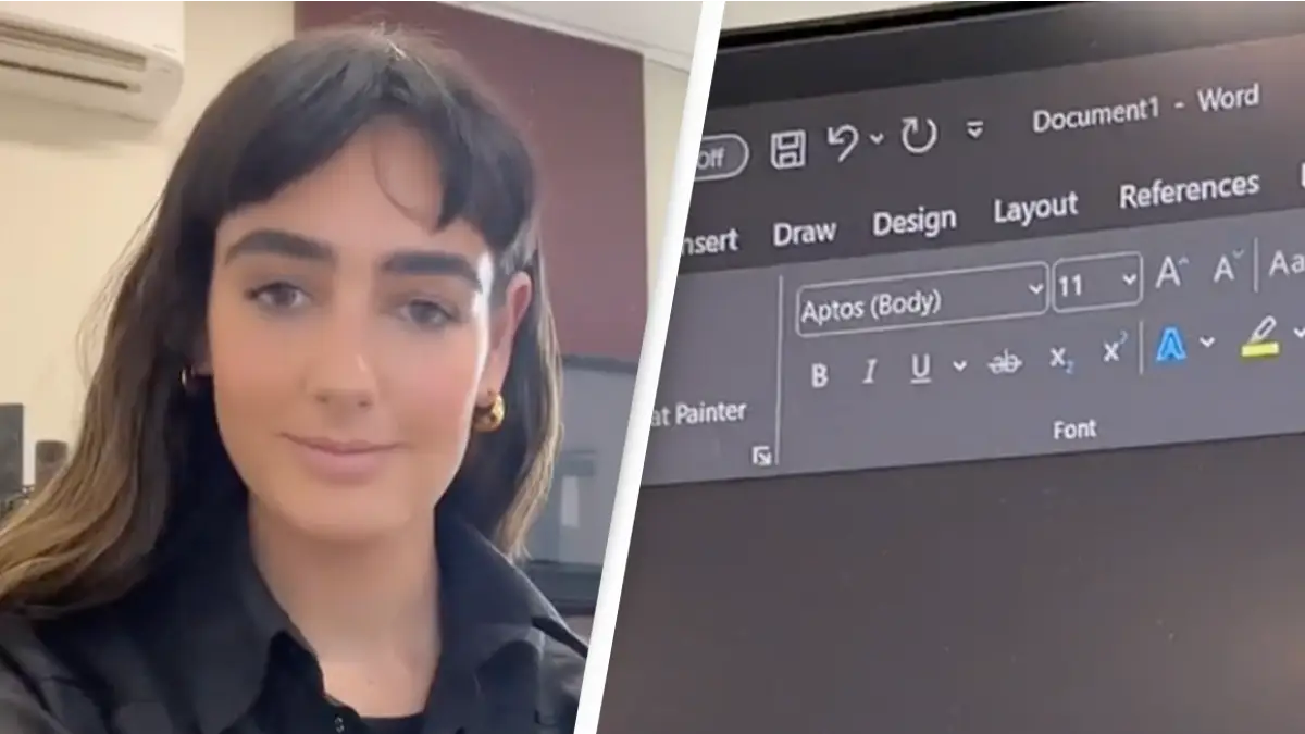
Microsoft users are flooding to social media in debate after the company changed its default font.
Ah, the good old fashioned debate about your favourite font.
Personally, I don't think much can beat a classic 'Times New Roman' or if I really want to jazz it up, I'll use 'Baskerville' - yes, I'm a basic b***h, sue me.
Sadly, if you'd been a die-hard Calibri fan since it first came on the scene as Microsoft's default font in 2007, you'll get a shock next time you check your emails, because a new font is in town.
Advert
Prepare to never send an email or start a word document in the same way again:
Calibri was Microsoft's default font for over 15 years, however by 2023, the company decided it needed a change.
The final phase of the change began back in July 2023 with principal program manager at Microsoft, Si Daniels, saying in a design blog post a 'new default font' was being put in place. This would be implemented 'across Word, Outlook, PowerPoint and Excel for hundreds of millions of users'.
Daniels said the new default would begin to 'roll out' over the 'next few months,' however, many Microsoft users are only just seeing the update now and flooding to social media to weigh in.

Breakwater IT took to its TikTok page earlier this month to reveal when it first realised Microsoft had changed its go-to.
The IT company exemplified the different font in a document which reads: "Really important word document. Filled with really important work information. (If you need business IT support services use Breakwater)."
The caption adds: "Us: Just trying to make it through the week. Microsoft on a random Tuesday in January."
The real question is, which font has Microsoft made the leap to after around 17 years of its default being Calibri?
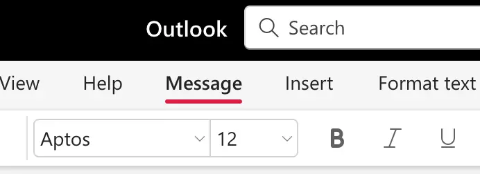
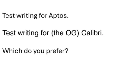
Well, the default font you'll now find when you start typing on your keyboard after opening up a Microsoft Word document is Aptos.
The font was commissioned by Microsoft, alongside four other new custom fonts.
Aptos - formerly known as Bierstadt - was designed by Steve Matteson and is 'a precise, contemporary sans serif typeface inspired by mid-20th-century Swiss typography,' Microsoft's website states.
It continues: "A versatile typeface that expresses simplicity and rationality in a highly readable form, Bierstadt is also notably clear-cut with stroke endings that emphasize order and restraint."
However, not everyone is happy about the change.
One TikToker commented on Breakwater IT's video: "I thought I had lost my mind! Changed it immediately."
"I will be Calibri Light till I die," another added.
However, others like the new default font, with one saying it actually 'looks a lot better' than Calibri.
Although another TikToker shared a video captioned: "POV: Changing the font of from Aptos to Calibri before sending emails, because it doesn't feel right."
So, what do you think?
UNILAD has contacted Microsoft for comment.