People baffled after learning why the Apple logo has a bite taken out of it
Topics: Apple, Technology
Topics: Apple, Technology
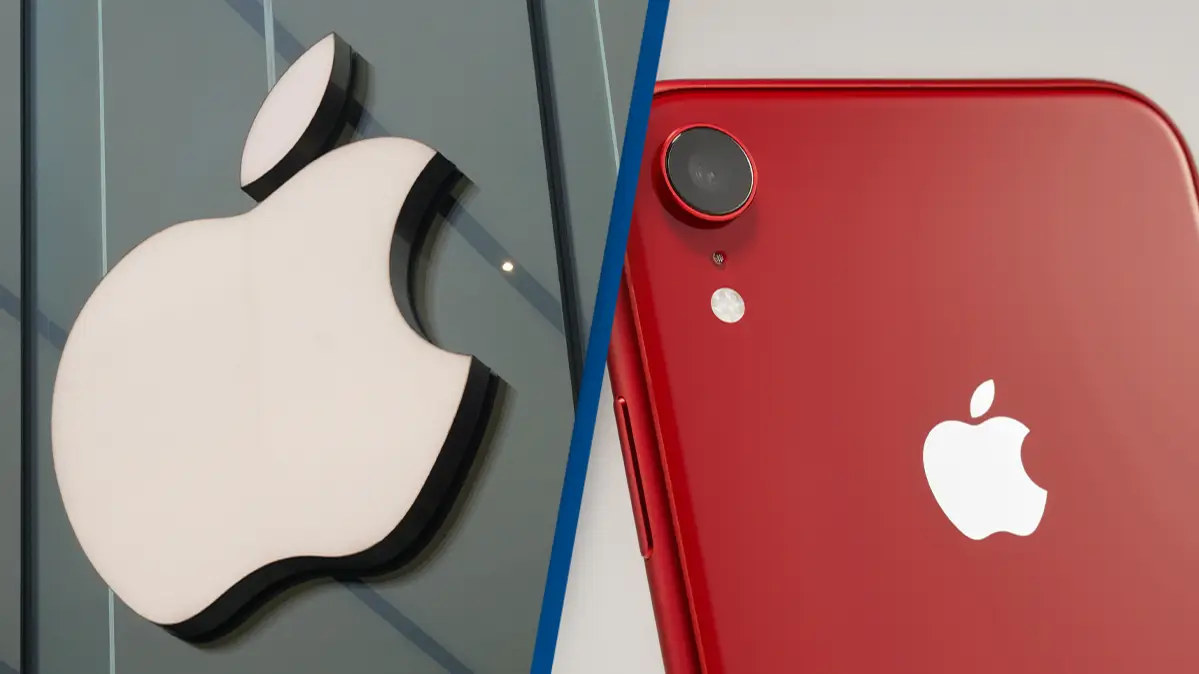
Apple is one of the most recognisable brands in the world, but there are many myths surrounding why the iconic logo has a bite taken out of it.
Given the sheer size and influence of Apple, you're probably used to seeing the logo plastered everywhere.
But have you ever wondered why it has a bite taken out of it?
No? Well, I'm going to tell you anyway.
Advert
Chances are that if you have ever wondered, you have probably heard one of the rumours surrounding it. However, the actual reason might surprise you, as it has been shocking some social media users of late.
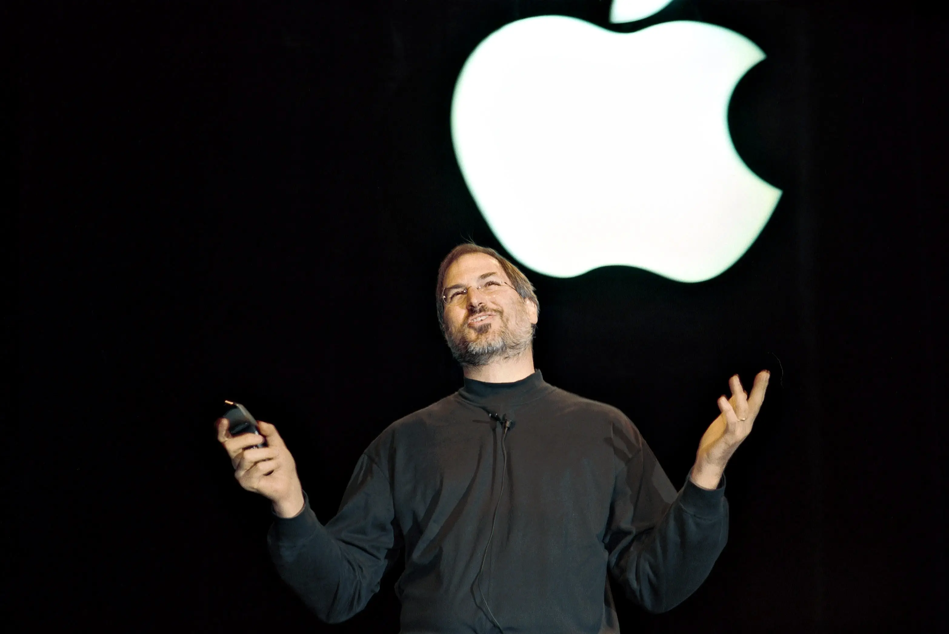
Despite its massive size now, Apple did have humble beginnings in 1977 as it tried to break into the computer technology market.
The brand's original logo of Sir Isaac Newton seated under an apple tree was a little too complicated to put on the side of every computer, so Steve Jobs sought help from an agency to design a simplistic logo.
In comes graphic designer Rob Janoff, who was given simple instructions from Jobs - ‘don’t make it cute’.
Sounds fair enough. Janoff opted to focus on the image of an Apple rather than typography, which was the norm for the companies’ competitors.
The graphic designer came back with a silhouette of an apple with a leaf on top. Simple, sleek and its an apple...job done.
However, the image was often mistaken for a cherry. Not ideal if you want to be able to plaster your logo everywhere and for people to immediately know who you are.
So, a simple solution was to take a bite out of it, making it even more clear that it was an apple.
They then added coloured stripes, as a little reference to the fact their computers could display color images, and boom you have your new logo that would be everywhere for the company in the 80s.
YouTube channel Apple Explained detailed this story on his page, much to the surprise of many social media users.
Some thought the ‘bite’ was just a play on words with ‘byte’, a unit of memory in computing, or that it was a reference to the biblical story of Adam and Eve.
When asked about the ‘byte' rumours, Janoff admitted that the wordplay wasn’t intentional.
“I’m afraid it didn’t have a thing to do with it. It’s just a small, happy coincidence,” he said.