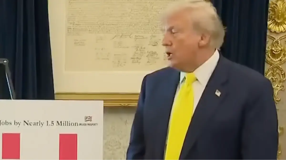
Donald Trump surprised journalists when he summoned them to the Oval Office to show off some shiny new charts, but viewers have been left baffled by his lack of attempt to explain their meaning.
Reporters were gathered at the White House on Thursday (August 7) for an event held to honor recipients of the Purple Heart, but they found themselves in the Oval Office first when Trump demanded a quick aside.
The president called the meeting after welcoming Stephen Moore, a senior visiting fellow in economics at a conservative think tank called the Heritage Foundation, and the co-author of the 2018 book titled Trumponomics.
As it turns out, Moore had put together some data on the state of the economy in the US after figures released last week by the Bureau of Labor Statistics (BLS) showed that the US had added thousands less jobs than forecasted in July.
Attempting to show things aren't as bad as the report revealed, Moore said reports from the BLS overestimated the number of jobs which had been created during the last two years of Joe Biden’s term - something Trump claimed was done 'purposely'.
Using numbers based on unpublished Census Bureau data, which can make them difficult to independently verify, Moore helped create a number of charts which showed Trump's success in his second term.
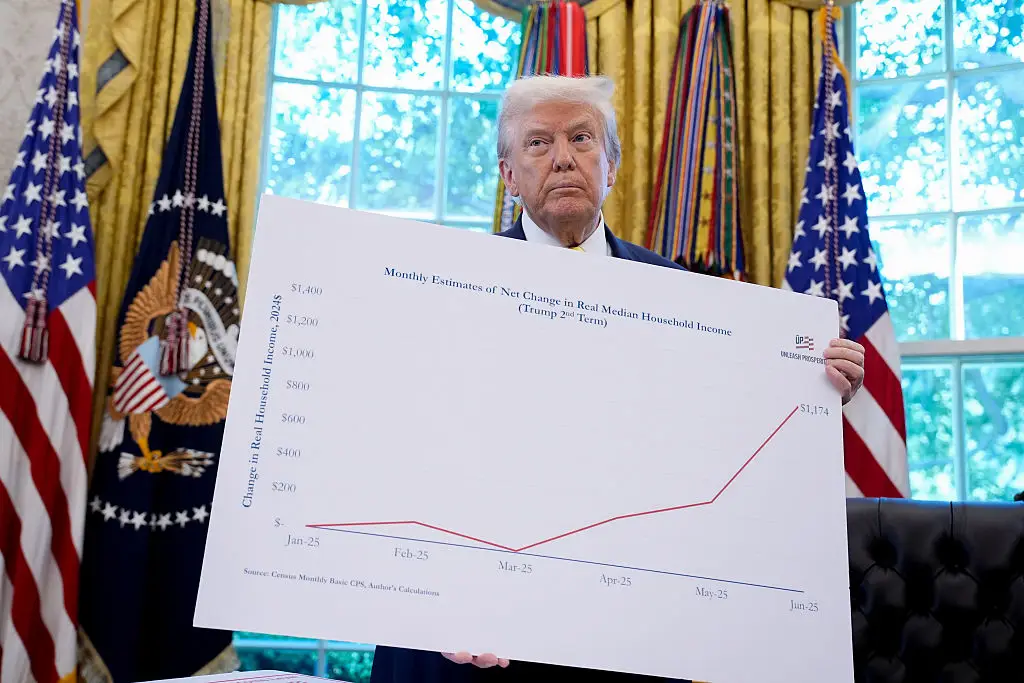
In his first five months back in Office, Moore said 'the average median household income adjusted for inflation and for the average family in America, is already up $1,174'.
Touting his success, Trump said: “That’s an incredible number. If I would have said this, nobody would have believed it.”
During the meeting, Trump alerted reporters to one chart he said 'says it better than anything', describing it as 'pretty amazing'.
The chart related to median household income (Yuri Gripas/Abaca/Bloomberg via Getty Images) The chart featured a line going in an upwards trend, but Trump didn't actually offer any insight into what the data showed.
Instead, he simply said: "All new numbers."
The bizarre scene caught the attention of viewers who were left asking one question: "How’s this real life?"
One viewer speculated that the scene was 'AI', as another added: "It’s like something from a sketch show."
Upon closer inspection, the chart in question is titled "Monthly Estimate of Net Change in Real Median Household Income", and shows figures rising from $0 to $1,174 since January.
Still, the lack of of a clear breakdown around the figures has only left people more confused, with one adding: "Why did no one from the media ask him what the chart meant?"

 Emily Brown