Wikipedia has spent years on redesign and no one's noticed it
Topics: Technology
Topics: Technology
When's the last time you went down a good old fashioned Wikipedia wormhole?
Well, if you've done so in the last, say, 24 hours, you may have noticed some very subtle changes - though there's every chance you would have missed it.
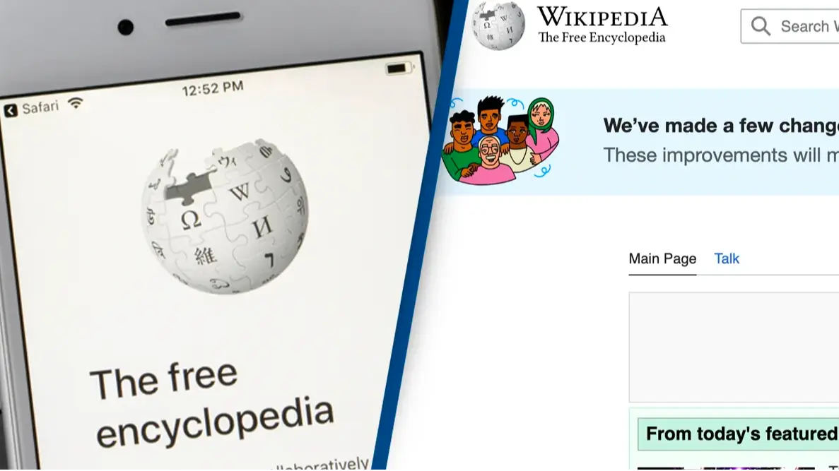
For the first time in ten years, the internet's trusty digital encyclopaedia has gotten a makeover, and they're pretty ecstatic about it.
If you've quickly switched over to Wikipedia and are struggling to spot the difference, you wouldn't be the only one.
Advert
The new design, titled 'Vector 2022', has been in the works for years with 'Wikipedians', as they're known, pouring over every excruciating detail, every little critique, only for it to be totally brushed off by users.
Since it launched on Wednesday (18 January), people have either not noticed the design change at all, or completely rejected it.
"My work over the last 10 years is also barely noticeable," commented one user after the changes were announced.
"I just checked and looks exactly the same?" agreed another.
"I barely see a difference!" added a third.
For a project that had more than 200,000 words of feedback to sort through, that's got to sting.
So, what's actually changed?
Well, you'll find there's a much more prominent search bar at the top of your screen, a sticky table of contents that remains visible as you scroll, and more obvious language switching tools.
But, perhaps the most notable difference, if any, is a whole lot more whitespace taking over the screen.
People - those who have actually noticed - do not like that detail. At all.
Thanks to the constantly visible table of contents on the left hand side of the screen, the main text on your Wikipedia page is now off-centre, leaving a huge portion of whitespace.
If you didn't notice it before, you definitely will now, and for that, I am sorry.
Thankfully, for those who have noticed the subtle differences, and hate them, there's a way to swap back to the original 'Vector 2010' design. All you have to do is scroll across to the side bar and click 'Switch To Old Look'.
And, if you want to go properly old-school - if you really have to be that person - you could even use the original 2001 version.
Of all the prep that went into creating Wikipedia's first new look in over ten years, the website is still missing the one thing that users have been crying out for - a dark mode feature.
"OK, but still no dark mode… how hard can it be, come on.." asked one of many disappointed users.
"Was hoping they’d give the people what they want: Toggle dark mode."
Maybe in another ten years?