Pepsi changes its logo for first time in years
Topics: Food and Drink, News
 Niamh Spence
Topics: Food and Drink, News
Drinks brand Pepsi has had a 2023 makeover and changed its logo for the first time in actually not quite as long as you might think.
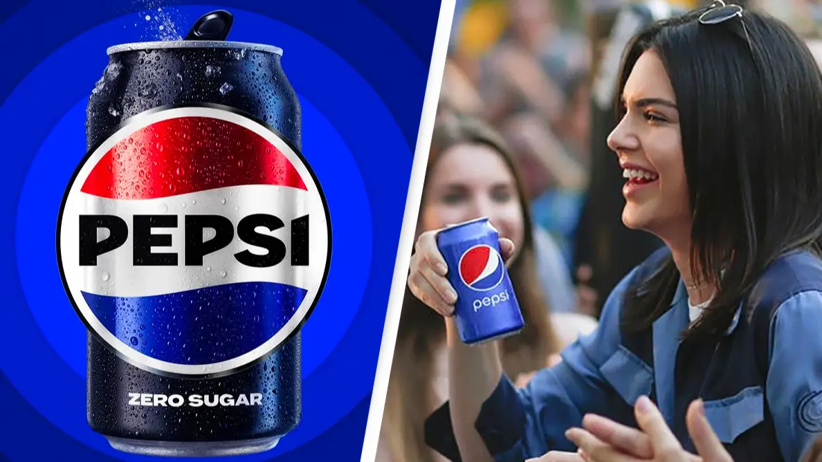
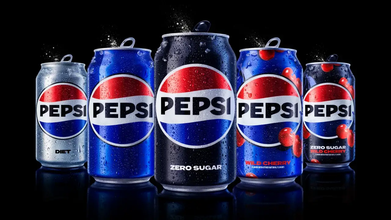
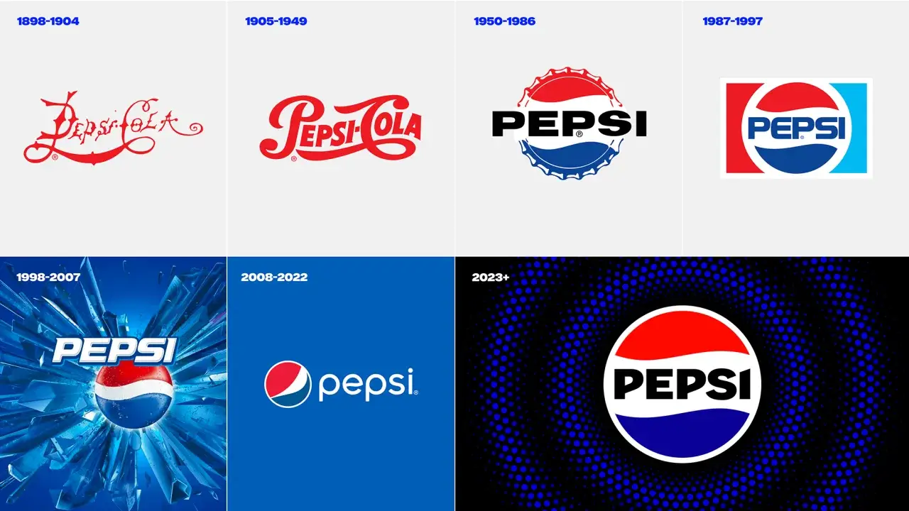
The drinks brand PepsiCo has been around for nearly 125 years since it started in 1898, and it's seen some unique changes over the years but the latest logo change comes as the company wants to draw attention to Pepsi’s zero sugar line.
See the new design here:
Advert
One of the reasons behind the change includes the fact that many people couldn't quite recall the actual Pepsi logo but had an idea that it included a variant of the red, blue and white colours and the Pepsi text somewhere on or in the circle.
Speaking to CNN, PepsiCo’s first ever Chief Design Officer Mauro Porcini said: "We couldn’t ignore that kind of insight.
"Instead of rejecting it, we decided to embrace it."
The 'Pepsi' in the logo is 'decoupled from the globe' noted Pepsi’s Chief Marketing Officer Todd Kaplan.
"It’s this lowercase, italicised font, the blue is a little bit muted … it doesn’t exude that confidence and energy that the brand really represents," he said.
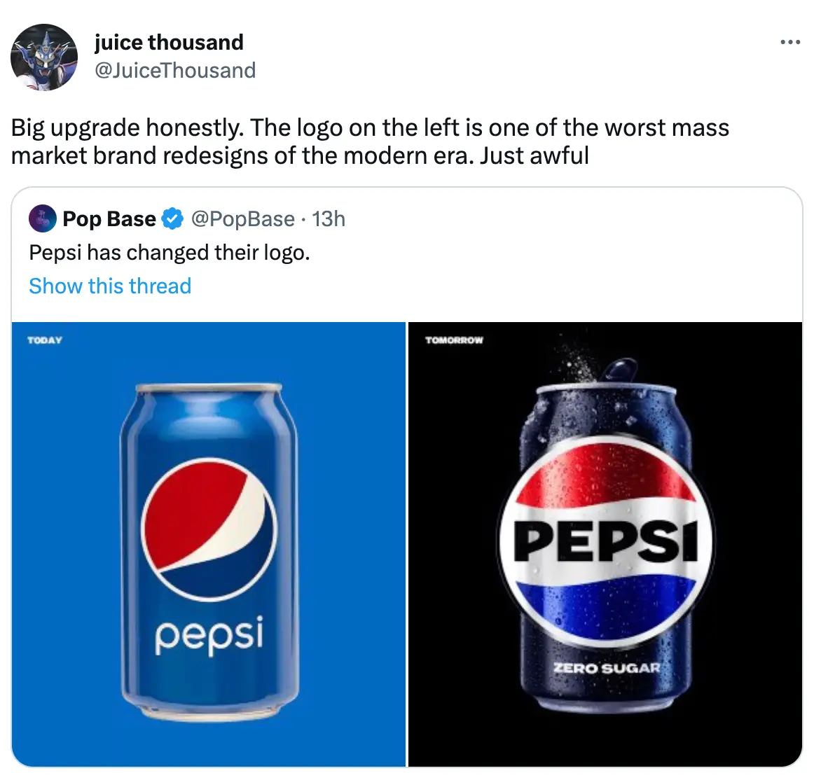
The new design has caused a stir on social media, as some eagle-eyed users spotted just how different the Pepsi logo looks since it first began in 1898.
One Twitter user wrote: "The original Pepsi logo is so upsetting. This is the work of a disturbed mind."
Some fans thought the latest logo was reminiscent of a certain national flag, as one pointed out: "They turned the pepsi logo into the netherlands flag."
Although on the whole many liked the new look, with one person praising the design: "Pepsi has a new logo with a lil bit of throwback flair."
Another added: "I HATED the 'smile' logo and that 70s Diet Pepsi font. Good to see their reverting to a modernized version of their 1969-1991 look."
"Pepsi has changed its logo. New one ate ngl," said a third.
While a fourth raved: "Pepsi updates their visual identity with a smacking new logo and quite frankly. I love it, find it really bold, more fitting to the Pepsi brand also has a nice old school feel to it."
The updated design comes in line with the brand wanting to highlight its move away from sugary drinks, as it embraces its zero sugar range.
Porcini explained: "Zero sugar is going to be the protagonist of our communication strategy. To highlight the zero line, the new logo uses black font and a black border, a nod to Pepsi Zero’s black can and label.
"The border also helps make the logo the defined center of the company’s new pulse campaign, which features lines radiating out of the pulsing logo in time with upbeat music in video ads and elsewhere."
It just goes to show that time does fly, the last rebranding only came in 2008.
While it might look different, the taste is set to remain the same so you can rest easy knowing that your favourite soda has not made amends to its much loved recipe.